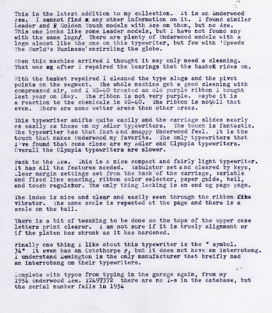
 |
| This typewriter was not all that dirty. |
 |
| The type slugs were really filled with dirt, grime and old ink. The degree symbol must not have been used much as it was not filled with dirt. |
 |
| pP, q, e, Dd, 9, g, etc. were especially filled. |
 |
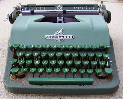
| The small keys on the very left and right of the top row are the TAB Clear and Set. |
 |
| Margin settings are easily and clearly seen through the slots. The left is not as visible in the photo as it is red. I should have fill flashed it. |
 |
| These are the margin stop setting buttons. They push in and slide. |
With a bit more searching on line I found this page on Alan Seaver's Machines of Loving Grace. It appears the Ace is a rebrand or different name for the same model. I suspected Universal from looking at other typewriters and from what was on Will Davis's website and Alan's site I found a bit more information.
Scroll about half way down the page in the link to two newer brown and tan Underwood Ace typewriters.


Nice color too! I like these 1950's Underwoods a lot, but rarely encounter them in the wild, which seems weird, considering so many were sold.
ReplyDeleteWhat a beauty! I had never seen such a machine either; but that badge on the typebar cover is fantastic! It certainly deserves becoming the blog header!
ReplyDeleteEven if it never typed another line, it would be worth hanging onto for the looks and the logos. It really is beautifully presented and the colours are very easy on the eye. Did you try Ted's trick of unspooling your ribbon all higgledy-piggledy into a cardboard box, spraying it, leaving it to soak and then wiping the excess off as you re-spool it. Me neither, but it sounds as though it might work well.
ReplyDelete@Ted, I've seen similar, but not this nice or with this Logo. I may start multiplying my Underwoods. There are some neat models I would like to add to my collection.
ReplyDelete@Miguel, My thought exactly when I saw this one advertised. I could not resist adding the new blog header.
@Rob, I fully agree. When I saw this I suspected it did not work because the seller avoided making mention of much of anything beside the not so good photos. I spotted the emblem on the front and between that and the color I had to have it.
I actually used Ted's method on this ribbon because it seemed it would be faster than my way. I think I got in too much of a hurry and ended with some places wetter than others. Ted's ribbon turned out purple though. Mine is more blue-black like blue-black fountain pen ink, a bit more black than the blue.
Fine looking little typewriter!
ReplyDelete