Sunday, July 22, 2012
Hermes Dilema
The lighting in my radio room is not the best for photos and I was too lazy to get the photo floods out. I do plan a future post on all of the Hermes when I get the first rounded body finished and some other projects out of the way.
When typing with this machine on a page beside where the regular pica is typed this font looks much cleaner and easier to read. One of the few serif fonts I like.
Anyone know why some of the Ss have a line through them and others have a short horizontal line beside them while others have the short horizontal line as well as the vertical line through them?
Thursday, July 19, 2012
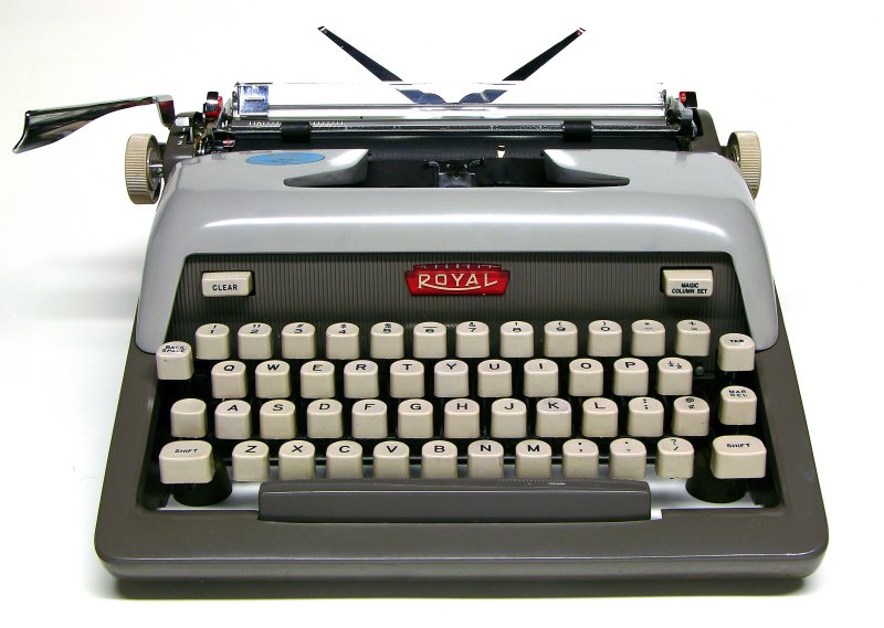
A Royal Crescent and Iowa Pig Poop
![]() |
| I am not one for a hard touch so there are many tops of letters missing when I do not press the keys hard enough. |
| Looks like a squashed down Futura |
| The carriage return lever is lowered for transport. Manual is included. |
| About the size of my lap top case without a shoulder strap. |
Tuesday, July 10, 2012
Subscribe to:
Posts (Atom)